

THE NEW CADBURY LOOK
Capturing the humanity of OUR foundation
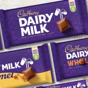
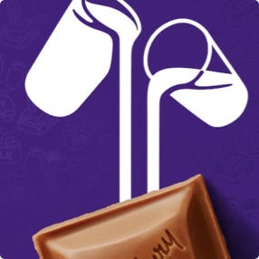
Mere days after Easter, Cadbury is back in our lives with a redesign by Bulletproof. The international brand and packaging design agency has redrawn the Cadbury wordmark to pare back years of overworking to return it to a closer resemblance of the company’s original signature. As for its landmark chocolate bar, Dairy Milk has a louder, bolder new image with a large, capitalised logotype, and a new pattern on its wrapper, plus a reimagining of the Glass and a Half icon that sees the milk pouring into a photograph of a chunk of chocolate.
“Our brief was simple,” says Nick Rees, global creative director of Bulletproof, “to move Cadbury from a joyful and sometimes artificial aesthetic to unlock the ‘generosity’ and natural goodness at the heart of the brand. Advertising had already moved streets ahead and the wider brand world was left wanting. The brand, however, was not in decline and we therefore needed to make big shifts without compromising the iconic assets and consumer love that make Cadbury what it is.”
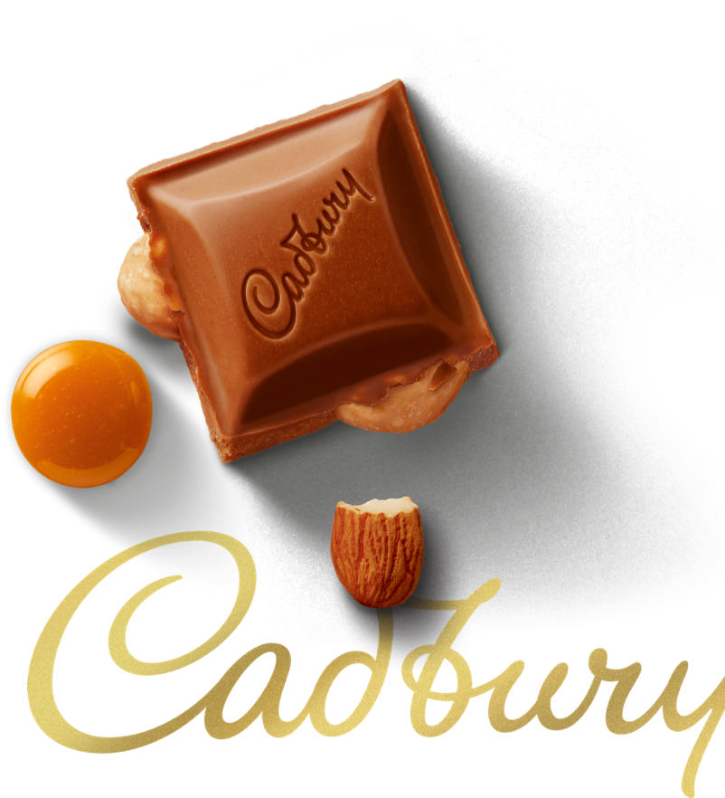
Bulletproof came up with a new brand strategy and rebuilt it “block by block” – starting with the Cadbury wordmark. “The Cadbury script had become polished and too refined over the years,” Rees tells It’s Nice That, “so we put the humanity back into it by making it what it always was… a signature.” The “elegant and timeless” Glass and a Half logo, which previously poured milk into the Dairy Milk logotype, has been repurposed to put product front and centre, through a photographed chunk of Dairy Milk on the packaging. Bulletproof chose top-down photography to celebrate the embossed Cadbury name. “If there’s one powerful image that defines all of our work, we think it’s the stripped back Glass and a Half icon flowing directly into the chocolate chunk.”


WE moved Cadbury from a joyful and sometimes artificial aesthetic to unlock the ‘generosity’ and natural goodness at the heart of the brand.


The Dairy Milk typography was hand drawn, again to capture “the humanity at the brand’s foundation”, cemented in a bold, uppercase lettering to give “pride and authority, but a really fresh modern punch,” Rees says. “Subtle nuances to some characters still add flow, and the small contact between the ‘r’ and ‘y’ of Dairy is delicate, but brings a lot of personality through.”
In the wrapper’s background in glossy purple is a new pattern based the original 1905 pack. This came from research the Bulletproof team undertook at the company archives at Bourneville. “[It is] an Aladdin’s cave of all the Cadbury brands throughout the ages,” Rees says.
“We took every opportunity to immerse ourselves and yet, the most powerful and inspiring find from the brand’s past was the founding principles of John Cadbury himself. His philanthropic vision and commitment to doing good was truly progressive for his time and so we were careful to not simply dig up heritage assets.
We’ve let heritage elements inspire our brand world for the future.” Bulletproof says this new pattern gives the packaging “an element of discovery”.
The new brand identity launches in Australia in May 2020, then South Africa and Malaysia later in the year, with other markets, including the UK & Ireland's, launching at the beginning of 2021.
Win a years worth of new Cadbury Dairy Milk